5 Strategic Ways to Incorporate Color in Your Paper Packaging
Why it’s an important marketing element you can’t ignore

You’ve likely heard the phrase, “a picture is worth a thousand words.” That’s because 65 percent of us are visual learners, according to the Social Science Research Network. Seeing a visual helps us quickly download the information presented. This couldn’t be more critical today as your customers are bombarded with more than 5,000+ ads and brand exposures per day.
Your packaging is one of the first opportunities to create a lasting impression. While many factors play into creating memorable visuals, color psychology research shows that certain colors can help create emotion, interest, loyalty and even trigger purchases. According to a University of Loyola study, color increases brand recognition by up to 80 percent. It’s one of the first elements our design team recommends customers consider when designing packaging.
Consider these five strategies to incorporate color into your packaging design.
1. Embrace the printable space.
 Your brand is unique. What makes sense for your company may not make sense for another. If your brand has a minimalist look and feel (think Apple) or it embodies energy and excitement (think Red Bull), consider how to maximize the printable space of your packaging that makes the most sense for your brand. Through bold color bleeds, metallic papers or clear windows that let the color of your product shine through, you can create a feeling and build a deep connection with your customers by utilizing the right color and printing techniques.
2. Consider color psychology.
While remaining true to your brand, consider the psychology of color and how it impacts buying behavior. Hubspot found that simply changing the color of a call-to-action button on its website increased conversions by 21 percent. Many brands utilize color to appeal to consumers on a deep level, affecting their mood and appealing to their emotions. For example, red evokes feelings of urgency; blue is often associated with freedom and security while yellow presents optimism. A study published in the journal, Management Decision, says people make decisions within 90 seconds of their first impression of a product, and color alone contributes up to 90 percent of the information that forms the decision. Having a general understanding of how color psychology can play into your customer’s emotions and learning how to apply those in your packaging design is an important step that can help you stand out from your competitors and deepen your customer relationships.
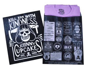
3. Make your product the color hero without using plastic.
 If your product creates a natural color story, consider packaging that gives it the attention it deserves. For example, stickers, magnets, and other accessories can often be beautifully displayed through clear envelope windows or transparent packaging without using plastic. You are one step closer to reaching your sustainability goals while showcasing the beauty of your product.
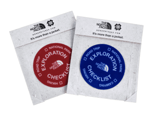
4. Create mental categories or groups.
We’ve discussed how certain colors can help create emotions, but they can also help categorize your products. While some colors can be universal ![]() (example: green or brown = sustainable) others can be specific to your brand. Color-coding specific SKUs can help customers easily identify what family of products they are buying and help them make a purchasing decision faster. Color can also identify the type of product you’re selling; for example, gold is often associated with luxury and red for romantic products. As much as possible, think about what colors tie in with your brand but also how color can set you apart from competitors in your industry.
(example: green or brown = sustainable) others can be specific to your brand. Color-coding specific SKUs can help customers easily identify what family of products they are buying and help them make a purchasing decision faster. Color can also identify the type of product you’re selling; for example, gold is often associated with luxury and red for romantic products. As much as possible, think about what colors tie in with your brand but also how color can set you apart from competitors in your industry.
5. Utilize high-end printing techniques.
The colors you choose for your brand’s packaging don’t really matter if the printing quality is poor. The importance of finding the right packaging partner is critical to your success. Some sustainable papers like glassine are difficult to print on and certain colors like yellow are particularly challenging to keep consistent. Finding a reputable and experienced printer who invests in high-end printing equipment and machinery is the only way to make certain the colors you choose will be represented properly and consistently from package to package and project to project. The goal is to embrace color and appeal to your customer with a beautiful and consistent representation of your brand.
JBM Packaging is a purpose-driven packaging manufacturer. Our innovative packaging solutions are developed in-house, with careful consideration given to your brand and business goals. From designing your packaging solution to printing, filling and even shipping — you have one single point of contact who will simplify the process for you from beginning to end.
Contact our innovation team to bring your one-of-a-kind colorful packaging to life!