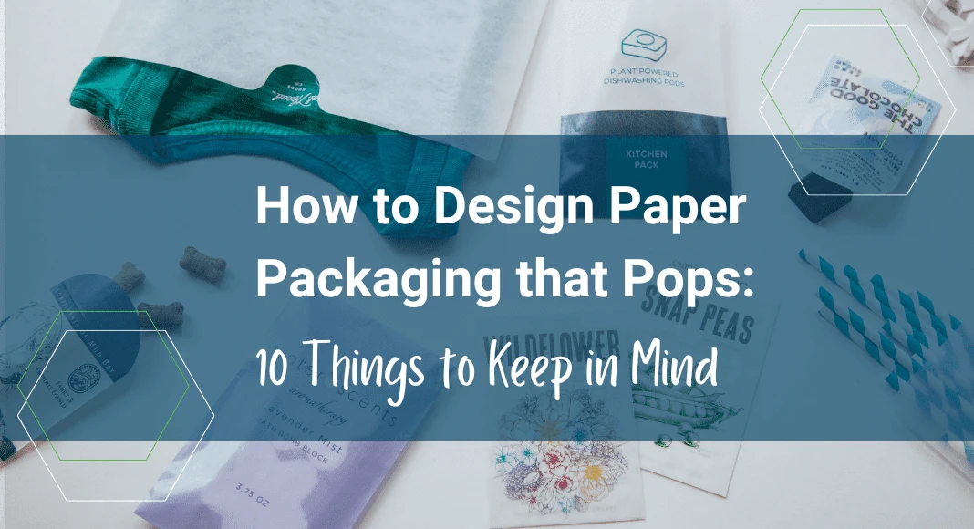
Good packaging should make a lasting impression, from the retail store to the moment a customer finds your product in their mailbox. But it should do more than attract your customer’s eye: it should also tell a story about your brand and product.
But that can be easier said than done—developing the right balance of color, imagery and messaging on your packaging can be a challenge for even the most prominent brands. And it’s essential to keep in mind that just because a package is designed a certain way, factors related to inks and paper can impact how that design looks once printed on a package.
Designing your package can be a cumbersome process which is why JBM works closely with customers from design conception to print-ready files, so we collaborate to produce a finished product that really shines.
To help you design memorable packaging that helps your brand get noticed, we gathered a few considerations from the experts on our design team. Here’s what they said:
- Select Color Carefully. Color delivers the first impression. It says “hello” to your customer and helps your product stand out on the shelves. Using vibrant colors enables you to attract attention and build interest. Still, it’s equally important to consider how you’re selecting colors and the type of paper you’re using for the package. We recommend using Pantone colors in logos and brand iconography to ensure the greatest accuracy. The Pantone system is a standardized color-matching system of more than 2,000 colors that helps ensure accurate reproduction. Whereas using “process” colors such as CMYK, where inks are mixed to create a specific color and may cause variation, Pantone colors are “spot” colors that ensure consistency.
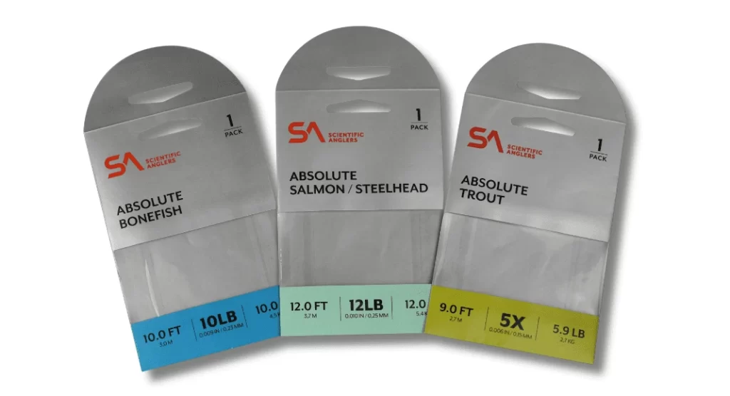
- Use Color to Distinguish Products: Color code packages to create product families and enable easy identification of product categories. For example, an outdoor sporting goods company used various colored banners to allow quick visual cues for customers looking at the product packets on retail shelves.
- Consider the Paper Type. The type of substrate or paper that you use can also make a big difference in the way your color prints. Uncoated papers can make colors appear dull and washed out, where coated papers can make color appear brighter and more vibrant—each makes a statement about your brand. For example, uncoated papers with a simple color palette can create a more natural and organic feel.
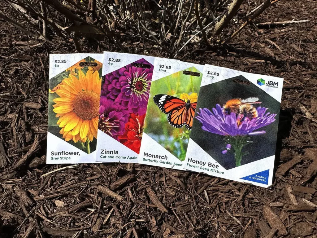
- Be Authentic with Imagery: The images and pictures you select should feel inviting to the customer and not overly staged. Avoid the common trap of using photos that feel artificial or stock, in favor of naturally staged photos or illustrations to present a warm and inviting environment. It’s also important to regularly update your imagery—it could be time for a refresh if you haven’t refreshed your product photos in a few years.
- Embrace features to improve functionality: When you make your customers’ lives easier, they appreciate it! Incorporate design features such as tear strips or perforations for easy opening, or if you have multiple products in the packaging, consider a latex adhesive for resealing. Ideally, you’ll want to create packaging that is as intuitive as it is innovative.
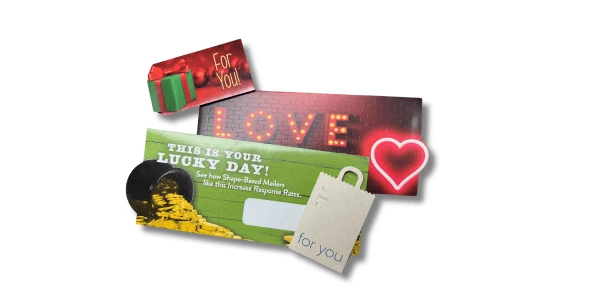
- Shape Your Story: Who says you must stick to a standard square or rectangular package? The shape of your packaging can outline your product, logo or an identifiable seasonal shape, such as a heart during Valentine’s Day. Similarly, you can cut different-shaped windows within your package to provide a unique peek preview of your product.
- Typography Matters: The type and size of font you select plays an important role when creating text for your package. Script fonts are difficult to read at a distance, so consider clear and bold sans-serif fonts for your primary messages. It’s important to also consider the size of the font in relation to the size of the package. Just because it looks a certain size on the computer screen doesn’t necessarily mean it will print at that size. Run samples to ensure the font size is legible once printed on the package.
- Embrace the [White] Space: A package doesn’t have to be filled with words to tell a story; in fact, some of the most effective packaging is also the simplest. If you need additional messaging space, think inside the package. Extend your message with a perforated tear-off coupon for promotions or important notes that are worth saving after the rest of the package is discarded or recycled. If you run out of room, pare down the copy to make your messages more concise or add a special insert.
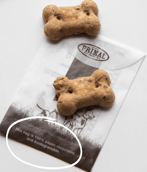
- Showcase Sustainability: From the materials you select to the messages on you share, use your package to help guide your customers on the journey of environmental responsibility. Incorporate end-of-life instructions to help ensure proper disposal and share badges and symbols to identify certifications and materials used in its construction.
- The Proof is in the Print: The colors on your screen may tell a different tale from what emerges from the printer. To avoid any issues, invest in color proofs, and consider ink drawdowns on actual substrates. When viewing the color proof, view it in specific lighting, such as direct sunlight or D50-validated lighting. In addition, clearly communicating your color expectations early in the production process will help ensure brand consistency and will save you from costly revisions.
Creating packaging that “pops” and stands out with your customers requires a thoughtful approach to color, paper type, imagery, functionality, messaging, typography and proofing. A great package doesn’t just capture your customers’ attention, it builds your brand’s story and reveals your values. Whether you’re refining an existing design or starting from scratch, keeping these tips in mind will help build your brand and connect with your customers.