Designing a Glassine Package? 6 Common Mistakes and How You Can Avoid Them
There’s a reason why people love glassine paper so much. It has a high-quality appearance, is cost-effective and is made from renewable materials. If a glassine bag escapes into the environment, you don’t need to worry about it contaminating waterways or hurting wildlife like you do with single-use plastics—it’s biodegradable and will leave no trace.
However, you can run into challenges printing on glassine if you don’t have the right supplier partnership in place. The process that gives glassine that smooth, glossy look, known as supercalendaring, can complicate things. A little preparation in the pre-press process helps eliminate printing issues, ensuring your packaging look great and meet your brand’s standards.
Here are a few common mistakes people make when printing glassine and how you can avoid them:
Mistake #1: Focusing on one part of the package.
A lot of designers focus on what will be printed on the glassine rather than how the design will look after the product is inserted and folded. It’s important to keep a holistic view of the package from the start of the design process when printing on glassine.
Consider factors including:
- The shape and color of the contents
- Alignment of the front and back after folding
- Legibility of text
- Ink coverage
- Positioning of seal and seam gum lines
- Knockouts, or the process of removing one color from beneath another, to eliminate color interference and increase clarity
Strategic Design: Because of its opacity, the entire package and its contents must be taken into account during the design process.
Mistake #2: Not taking the color of the paper into account.
The paper substrate acts as another color and has a significant impact on how ink looks on printed products. For example, colors look completely different when printed on white woven paper compared to brown kraft, and the opacity of glassine can make colors look even more out of the ordinary on its glassy surface.
Even when using a flood coat—a thin layer of ink applied uniformly across the entire front or back of a package—graphic designers must be mindful of what will show through the printed surface.
Mistake #3: Poor color-management practices.
Experienced designers use several tactics to deliver the correct colors to glassine packaging. By eliminating extraneous printing and minimizing the size of glue knockouts in their layout, designers can safeguard from color interference. This is especially important on seal flaps, which will fold onto the back of the envelope.
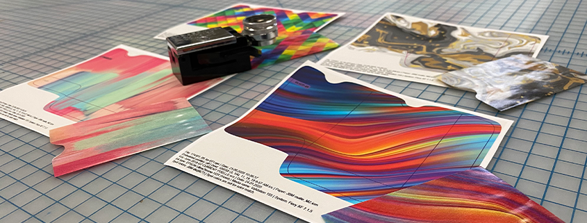
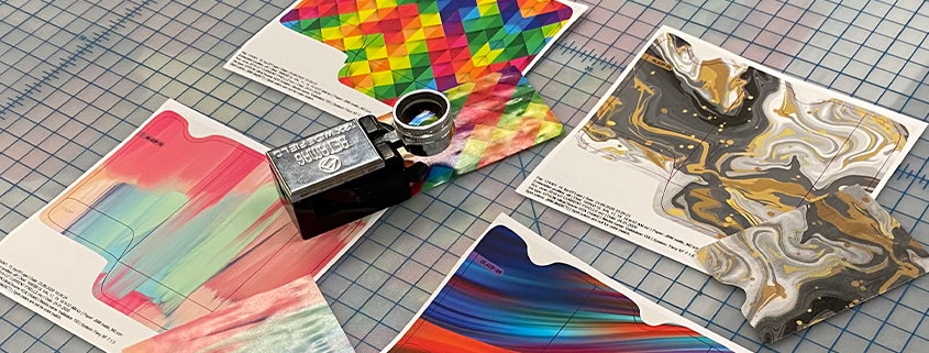
Another key to optimizing color management is to develop color profiles specific to printing on glassine. The Idealliance G7® Master program is the world’s leading print facility validation program, and its certified facilities offer the best color quality and printing consistency in the industry. G7® Masters have tight controls for color accuracy and predictability in place. They also have proven that they can match results from proof to press, even when printing on translucent glassine. Look for partners who have this level of expertise available.
Mistake #4: Underutilizing metallic inks.
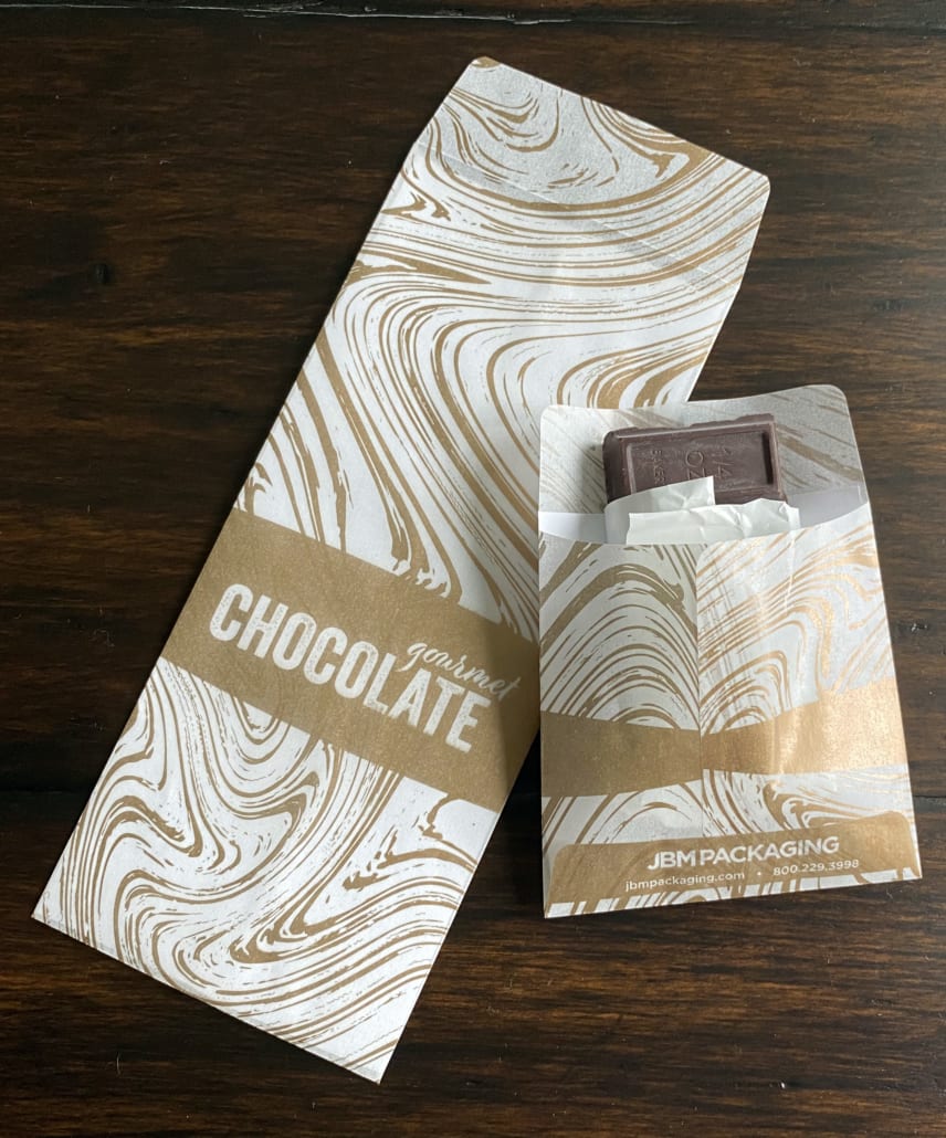
Metallic inks message value with a look of luxury – especially gold and silver – as they create the look of a high-definition print at a relatively low cost.
And because they become more opaque than other inks when dried, metallic ink used in logos, branding elements and large areas of color with text knockouts, will truly pop on your glassine packaging. Vegetable oil-based metallic inks are available offering a sustainable, cost-effective alternative to replace metallic foils and papers.
Metallic inks contain particles that rise to the surface during the drying process and reflect light to create a metallic sheen. The less porous the paper, the greater the metallic effect that is produced, making glassine a perfect substrate. When coupled with naturally transparent, four-color process inks applied multiple times on a single pass of the press, opaque metallic inks can be overlaid with a myriad of colors, further expanding your color options.
Mistake #5: Not testing printed barcodes.
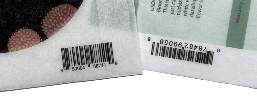
Bar codes – which read the ratios between the black and white areas to identify products and pull pricing – can be printed on glassine by expert printers. However, one-dimensional bar codes (horizontal rows of simple lines) and two-dimensional bar codes (including QR codes) should be tested on glassine with the contents inside to ensure scanning is operational.
Mistake #6: Poor communication and lackluster partnerships
Printing on glassine requires both expertise and experience with printing processes and inks, especially to achieve fine-line images in vivid, full color.
Strong partnerships are formed when designers interface with customers directly to prioritize their needs for the packaging. A successful partnership with clear communication about priorities allows designers to make the necessary adjustments and mitigate challenges to the package’s look and functionality.
The Partnership Difference
If you’re looking for an eco-friendly, high-quality packaging solution, glassine is a great option that is sure to wow your customers. To make sure your designs look as good on the printed package as they do on the screen, identify a strong packaging partner with the expertise and communication to help you avoid common challenges that arise during the printing process.
For more than 15 years, JBM has manufactured billions of glassine bags and envelopes, heavily investing in research, equipment, and people to ensure the best quality product and experience for our customers.
Our pre-press and production teams start by listening to our customers so we have a clear understanding of their packaging goals. By communicating common challenges that might arise while printing on glassine, we work with our customers to identify solutions that allow for faster production, superior quality, and a final product that is better for the environment.
Learn more about how JBM’s glassine printing services can work for you.


